
FaithStreet: Increasing usability in many hats
Bridging the gap between product development and our customers
FaithStreet's mission is to help people find meaning in community - specifically, by helping faith communities grow in numbers and in funding. They do this through their church directory, online donation platform, and popular blog, OnFaith.
At FaithStreet, I wore many user-facing hats in addition to designer - in sales, customer success, customer service, marketing - and all of these helped me gain an accurate understanding of our current and potential customers' needs, prioritize those needs, and design product solutions that would best meet those needs. I worked with the CTO (Glenn Ericksen) and former lead designer (Mark Hendriks) on many of my projects, with Mark taking on most of the visual design.

My design process at FaithStreet
Case Study #1: Helping church accountants obtain relevant donation information so that they can do their jobs efficiently
Problem
When we first started thinking about how to create our online donation platform, our CTO and I started by creating personas based on what we knew about our target audience. These personas were refined over time as we learned more about the people who were using our product. One of these personas was the church bookkeeper/accountant.
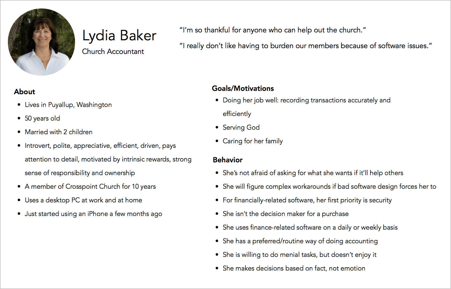
Persona for a church accountant
We quickly realized that someone like Lydia was our most frequent user - logging into our platform multiple times a week to check deposits and balance the books with new donations made. Our initial features, however, were focused more on the product purchase decision maker(s) - the lead pastor or the church council (the "board" of a church) - and not Lydia. And as our customer base grew, the support requests from all of the bookkeepers and accountants grew, because we hadn't addressed their needs with our MVP.
My objective was to figure out the information that these accountants needed and make them available in our product in an easily accessible way. We wanted our superusers to be satisfied with our product and how it fit into their workflow.
User testing
To gain a sense of their needs, I scheduled user interviews with 6 bookkeepers from our customer churches.
Before using online donations, an accountant's workflow included many steps, including collecting cash and checks, making deposits, and then recording transactions. After starting to use online donations, the steps were simplified. However, I discovered that the accountants still had to make additional calculations in order to get the numbers they needed.
Based on what I learned in the interviews, I realized that there were many repetitive and unnecessary steps in the accountants working with our software, so I simplified the transaction information presented in our software to what they needed most, keeping in mind that we needed to meet the needs of accountants using different workflows and financial software.
Solution
Now, every accountant had the information to do their job efficiently, with all the information they needed each week easily accessible on one page.

We found success through an increase in Net Promoter Scores and positive qualitative feedback from accountants. Also, the number of support tickets related to accounting decreased significantly.
“Cathy is a very talented designer. Quick learner and a good problem solver. She impressed me during our mentoring sessions and has been consistently great to work with.”
“Cathy is one of my favorite people I’ve ever worked with. Cathy worked for my company for 2+ years, focusing on design, product management and customer success. She is bright, compassionate and thoughtful. She has a keen ability to identify customer problems and create product solutions that address those problems through design. She has a great aesthetic and a tireless work ethic. She makes her colleagues better employees and people. Cathy is an A-player and any team would be lucky to have her.”
Case Study #2: Creating the UI for finding your church on mobile
Problem
I was tasked with designing the right interaction and input involved in a person, who wants to donate to their church, being able to find their church on our platform, using a mobile device.
I wanted the donor to input as little information as possible, while being able to find his or her church quickly.
I considered versions of search with the following inputs/filters/factors:
- Church name
- Church city and state
- Church photo
- Using GPS location to automatically show nearby churches
- Toggling between churches that are "near" and "far"
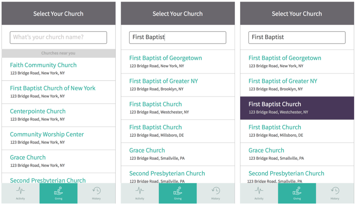
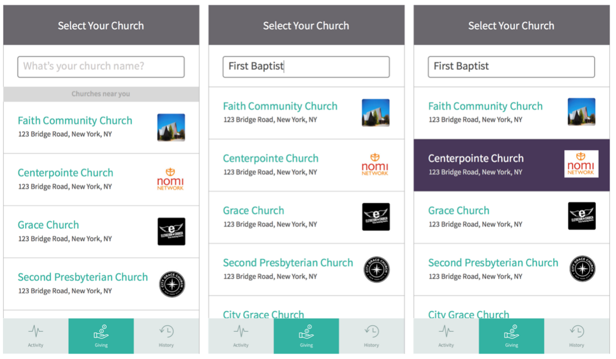
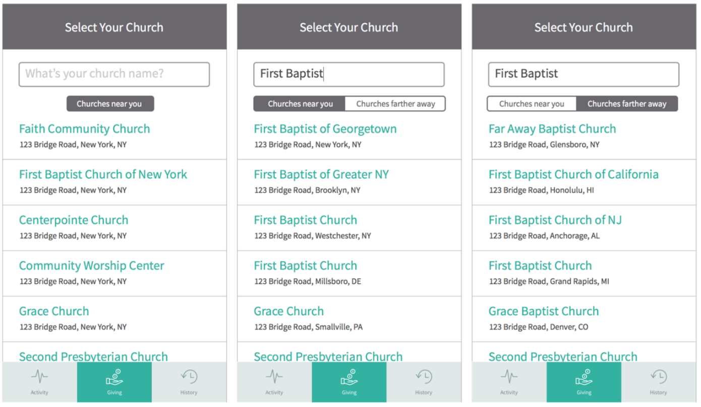
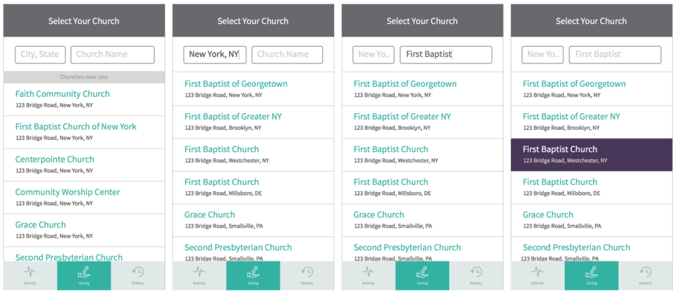
Finally, considering that GPS auto-detection was enough information to sort through our 16k churches at the time, we went with that, along with a church name filter. We also changed the clickable link to a "select" button, which was an affordance that was clearer to our older audience.
